Brent, Author at Randall Branding Agency
Randall Branding Agency

Here’s what we’re up to.

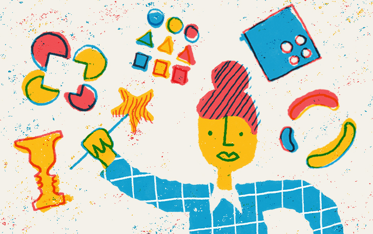
Mood Boards: There for you when words aren’t.

Mood Boards

Sometimes it can be hard to put a feeling into words.

In the middle of a project, we’ll find ourselves reaching for metaphors to help us get an idea across. One of us will say, “this logo needs to feel less like wearing Tevas and more like wearing Birkenstocks.” Or, “this copy needs to be less Beatles and more Rolling Stones.” Comparisons like these are a little off the wall, but they can be enormously helpful.

Mood boards are helpful in a similar way. Say you’ve determined your brand’s core attributes — your business is scholarly, refined, and graceful. (Haven’t gotten that far? Check out our post on research.) It can still be hard to make the jump from the conceptual to the visual (what does scholarly look like?). If you’re trying to make that jump more easily, mood boards can be your trampoline.

What is a mood board?


Mood board

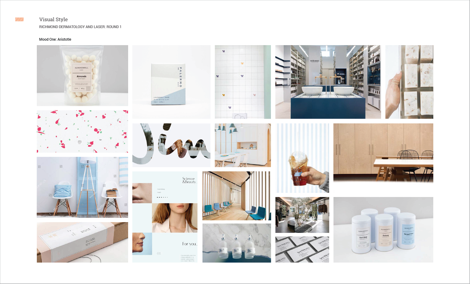
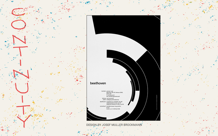
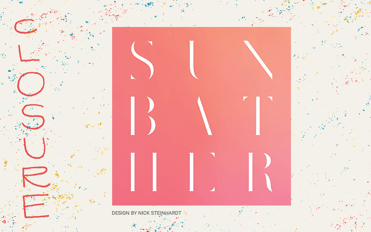
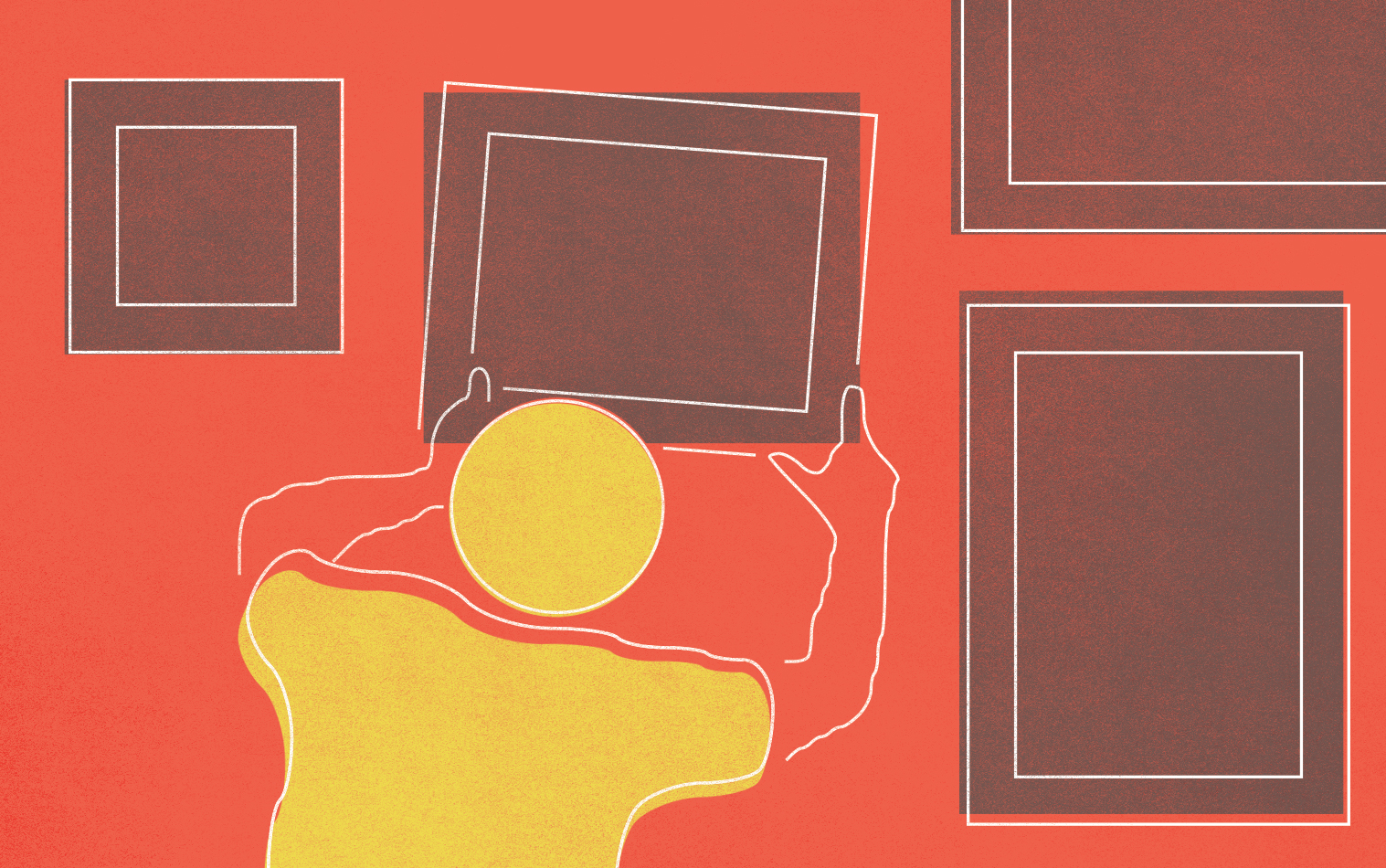
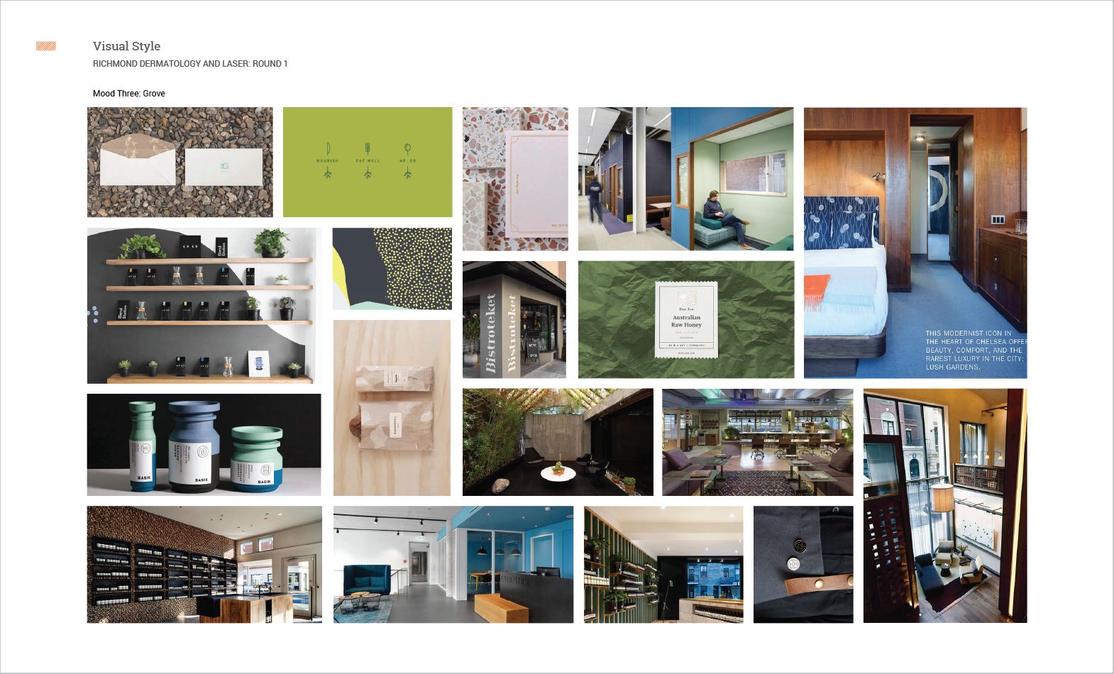
A mood board is a collage of photographs, colors, and textures that all speak to your brand’s values, culture, and vision. Using magazines, swatches, and this thing called The Internet™, we gather a bunch of visual materials that are relevant, aspirational, or even metaphorical. Then we curate and edit — collaging together the images that we feel are the most evocative of your goals and your brand.

How is it helpful?


Mood board

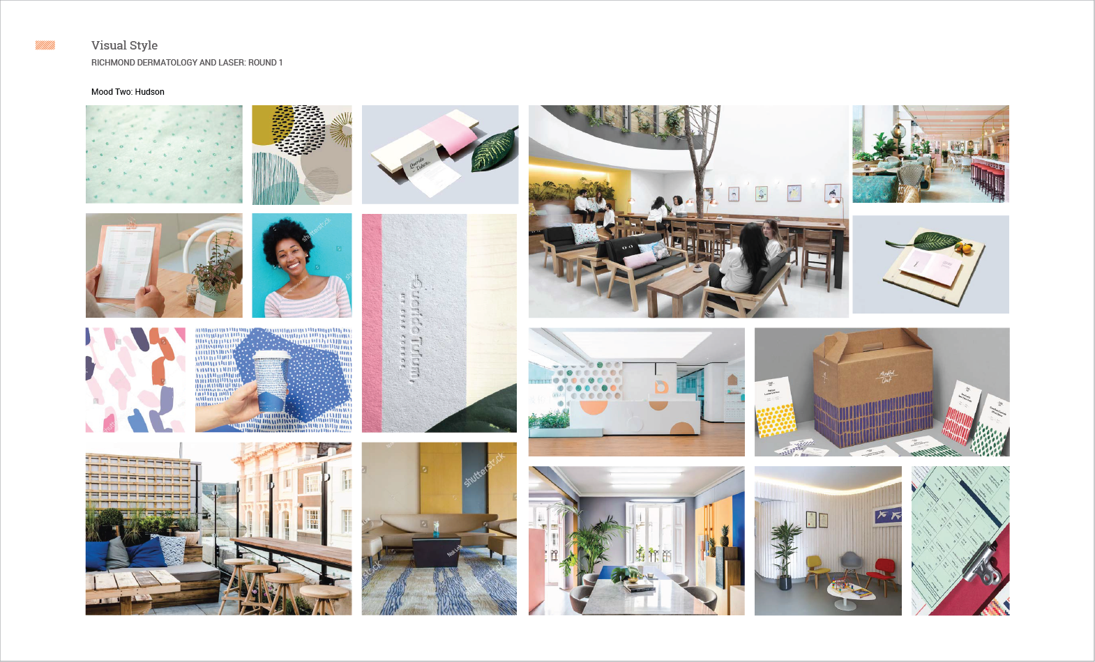
Mood boards help us get closer to the brand’s personality. This initial attempt to visualize the abstract—deciding what does and doesn’t belong—brings focus to the overall vision.

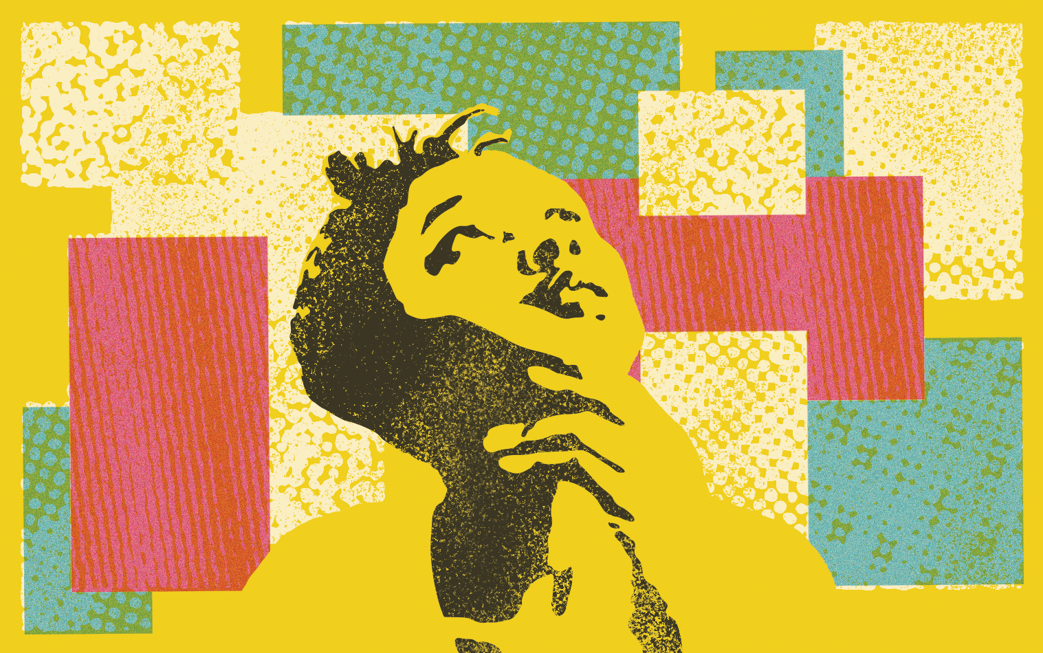
In addition, mood boards also help us make new and unexpected connections. Sometimes stumbling across an image or pattern can serve as inspiration for a brand’s palette or for a unique graphic element. 

Lastly, getting everyone excited about the brand’s ‘at a glance’ can unite the team and articulate a clear path. It’s a great way to establish supportive connections, assuage doubts, and begin the design phase with confidence.


Where do we go from there?


Mood board

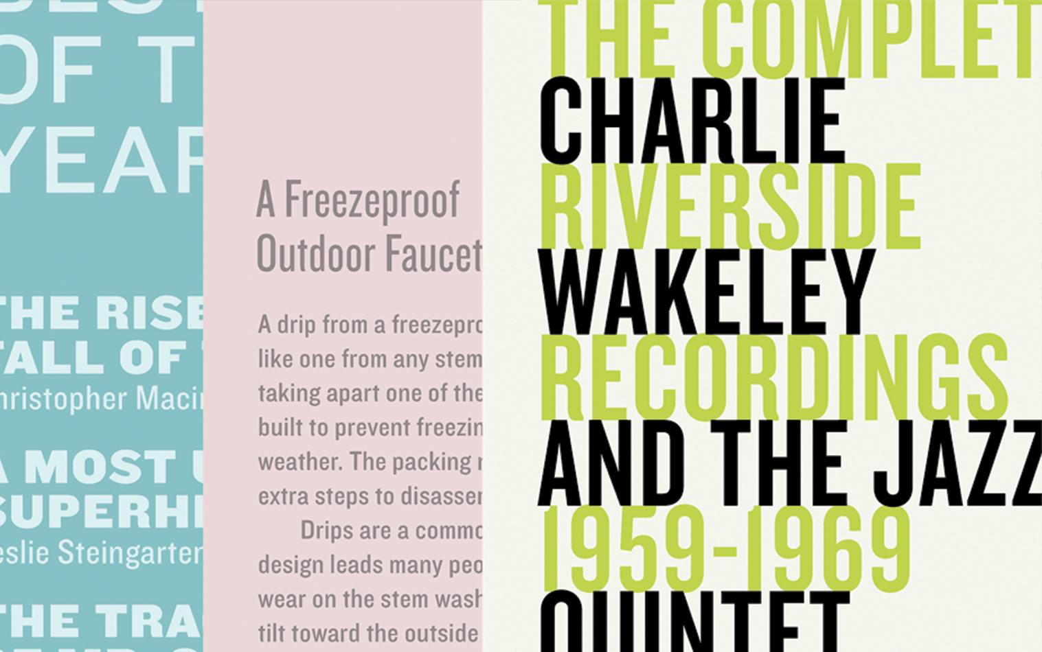
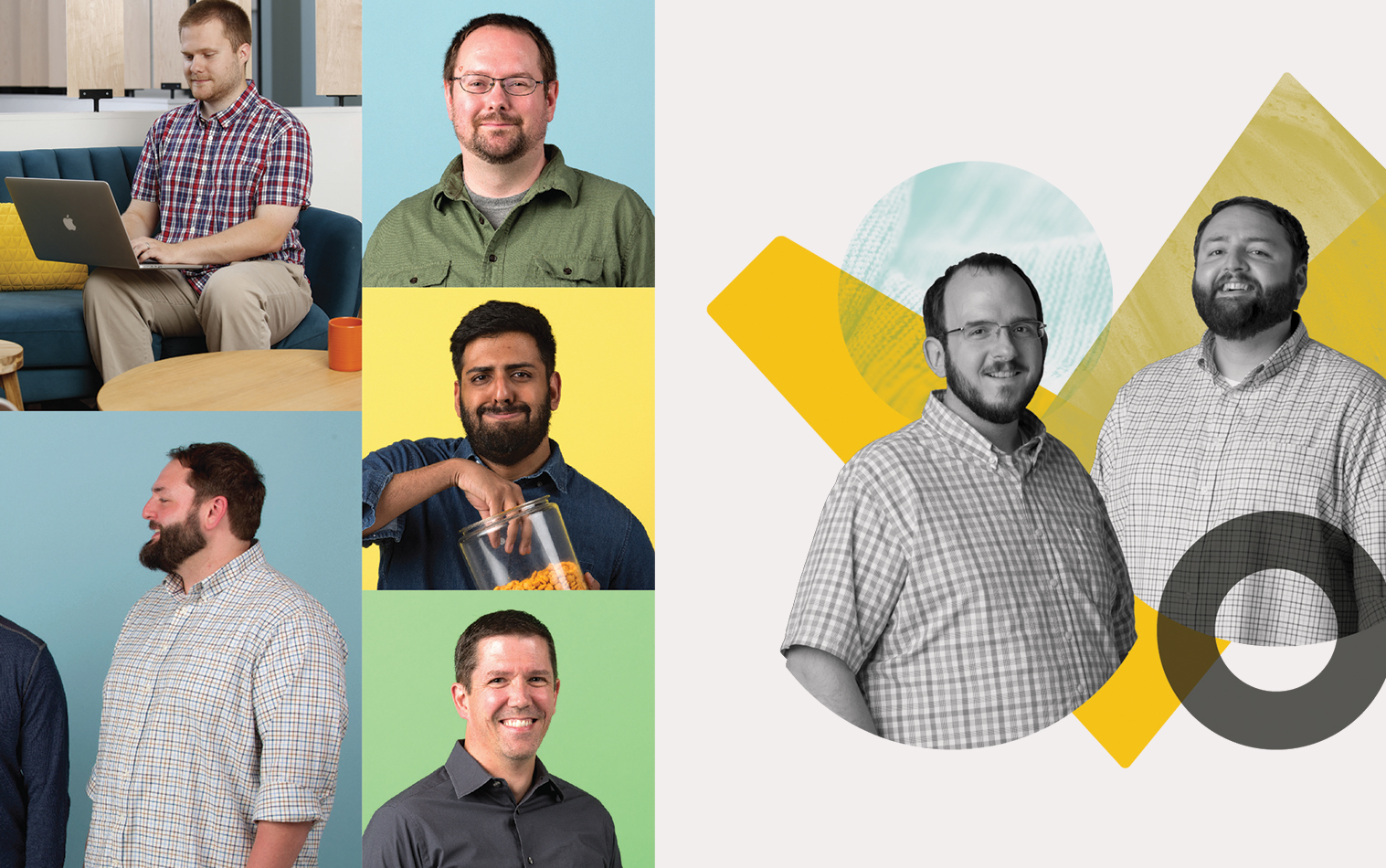
After agreeing on a mood board, we typically dive into design, creating the visual style—a set of two or three items that act as the template for your brand’s overall look and feel. During this process, we constantly reference our mood board, letting it guide our decisions about typography, palette, graphic elements, and more. Think of mood boarding as the widest part of a funnel. Then, as we move forward, we narrow, refine, and customize. At the end of the process, your brand will be represented with a specific and own-able identity that “just feels right.”

Pretty cool huh? We think so. It’s proof that with the right tools, you can achieve your goals—even when articulating them is hard to do.

If you want to learn more about mood boards or if you’d like us to help your brand out, you can contact us here. Want to know more about us? You can jump over here. If you’d like to see what we do, you can always jump over there.

Gestalt: 5 Principles that Demystify Great Design 

gestalt and great design

Have you ever looked at a beautiful logo and wondered, “Dang! What kind of wizard made this? This is a mysterious art form I’ll never fully understand!” The designers here at Randall Branding definitely have. It’s easy to be spellbound by a flawlessly executed visual idea.

Good design can feel magical, but there’s a lot of at math and science at work. From grids to the golden rectangle, rational thinking plays an important role the in design of brochures and bottles alike.

A great example is gestalt, which is a branch of psychology. One of gestalt’s central tenants is that our brains crave order, and naturally try to organize parts into a global whole. Designers can take advantage of this — and become wizards — by incorporating the following principles into their work.

Foreground/Background

Our brains naturally separate foreground elements from background ones. Making the foreground/background relationship obvious through contrast in color and form can help highlight important objects. Alternatively, making the foreground/background relationship ambiguous can create dynamic compositions. When an object wavers between foreground and background, our brains are entranced and delighted.

fgbg_blog

Similarity

We perceive elements that share color, size, shape, or texture as belonging together. Deliberate repetition of similar elements creates a visual rhythm that pleases us in the same way that musical rhythm does. In addition to being aesthetically pleasing, similarity in formatting allows us to process and understand content more easily.

similarity_blog

Proximity

Our brains perceive things that are close together as being related. Positioning several elements close together creates a whole, or a group. Groups draw our focus by creating a unit that has more visual presence than that of each individual element on it’s own. Reducing the distance between related content also increases usability and comprehension.

proximity_blog

Continuity

We have the tendency to continue lines and edges beyond where they technically end. The edges of shapes extend into the negative space and create pathways that our eyes use to effortlessly navigate from one area  to another. Good design uses shape and alignment to create fluid pathways between individual parts.

continuity_blog

Closure

Our brains can perceive an object as being complete, even when parts of it are missing or obscured. When elements are arranged in a certain way, the brain extends lines and creates imaginary contours. Suggesting the whole, as opposed to dsplaying it explicitly, can create a dynamic visual puzzle that brain revels in solving.

closure_blog

See? It turns out good designers are a little less like Harry Potter and a little more like Spock. If want to geek out with us about Gestalt, or if you’d like our designers to work some non-magical magic for you, you can contact us here. If you want to know more about us, you can jump over here. If you’d like to see what we do, you can always jump over there.

Until next time!


Design is the Details: Creating an Inspiring, Ownable Brand

Design is in the Details

The writer Annie Dillard once remarked, “How we spend our days is of course how we live our lives.”

Her observation exposes our tendency to downplay and dismiss the tiny everyday moments. But as the saying goes, god (or the other guy) is in the details. The success of any venture often depends on the small stuff. The designer Charles Eames was known for saying, “the details are not the details. They make the design.”

These sentiments all get at an underlying truth of branding: details matter. Sure, if you get a majority of your brand’s look correct, you do a lot to encourage your audience and create a sense of legitimacy. But it’s those seemingly insignificant touches that make your brand inspiring and leave a lasting impression in someone’s mind. Here are a few examples of sweating the small stuff and coming out on top as a result.

Apple is famous for it’s attention to detail. It turns out that the rounded corners on their devices are crafted with what’s called curvature continuity. Whereas other rounded corners create an abrupt highlight, this technique creates a smooth, natural one.

The smallest change in type can bring energy, wit, poise, and dignity to a design. Pairing typefaces is a fine art, and in this primer, Hoefler & Co demonstrate the skill and sensitivity necessary to do it right.

For our friends over at Simple Thread, we considered everything from custom photography to how the buttons were formatted. The result is a look that reflects their mixture of expertise and whimsy, and is totally ownable in their competitive space. 

So the next time you think that shade of red is close enough, or that the difference between Helvetica and Arial is splitting hairs, remember, those details are the ultimate separators! Getting them right is what elevates and distinguishes your brand.

As always, If you want to know more about us, you can jump over here. If you’d like to see what we do, you can jump over there.