Typowhat? The Ins and Outs of Typography

When you work with designers, you may hear them refer to the typography of a display ad or the typeface they’re using on a poster. What does that mean, you ask? Well, typography in simple terms means the style, arrangement, or appearance of printed letters on a page. It’s how we designers make an advertisement that will be both effective and visually compelling.
To go a little bit deeper, typography is made up of typefaces, or in other words, fonts. There are thousands of typefaces out there on the Internet, but how you choose and utilize them is part of how you ensure your work will be successful. So, let’s talk a little bit more about typography, shall we?
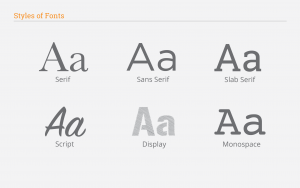
There are six main styles of typefaces. Serif typefaces include small embellishment lines at the end of a letter or symbol. These typically have great readability, so they’re perfect for large areas of text. Sans serif (i.e. without a serif) simply does not have that embellishment, giving it a modern look. You’ll notice these on websites and traffic signs because of their limited detail. Slab serif is a form of serif typefaces. You may recognize it used on our website! Script is the next style, which can have both a formal or friendly look. Display typefaces are used to get the attention of an audience, but shouldn’t be used for large areas of text. Lastly, monospace means that each letter occupies the same horizontal width. This was more popular several years ago when a typewriter only allowed letters to be so wide.
Phew. Now that we’re finished with styles, let’s move on to the nitty gritty stuff of typography!
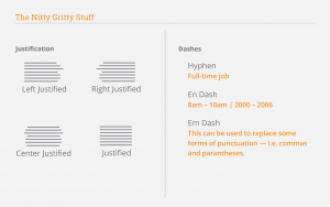
There are four types of justification: left justified, right justified, center justified, and justified. Left justified will be the easiest for a readers’ eyes to comprehend, whereas right justified will be the hardest. That’s why it’s best to make most areas of text left justified, while keeping right justified to smaller areas, such as call-outs in an article.
Did you know there are actually three ways to correctly use dashes? You’ll recognize the first one. A regular dash is used to connect two words, such as “full-time job.” The next one, an en dash, is slightly longer and is used between a range of time. You can type this by pressing Opt+- on a Mac, or Ctrl+- on a PC. An em dash is even longer, and this is used to replace some forms of punctuation, like commas and parentheses. You can type this by pressing Opt+Shift+- on a Mac or Ctrl+Shift+\ on a PC.
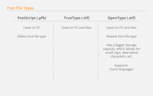
The last thing you need to know is font file types. Our clients will often ask us for the working files of projects. This way, they can make small edits to the text over time. We package the entire file together including the production files, images, and what’s most tricky — typefaces. These don’t always work when the client goes to download them on their computer. The font file type that we purchase may not match their computer’s ability to download the font. Nowadays, we try to stick to OpenType (.otf) typefaces, which are usable on Mac and PC, so that our clients may use them with no trouble.
There we have it! If you’d still like more information, please don’t hesitate to contact us here at RBA. We’re always happy to answer questions!


