Lunch and Learn Series: Type in Two Parts
We teamed up with the fine people at Torx Media for a monthly Lunch and Learn series in Suite 200. Just like Keynote slides and Jojo’s buff chick pizza, we go great together, and decided to share the fun on our blog!
Megan kicked off our design team’s two-part presentation with an abridged history of typography, à la Mean Girls. Here are the highlights.
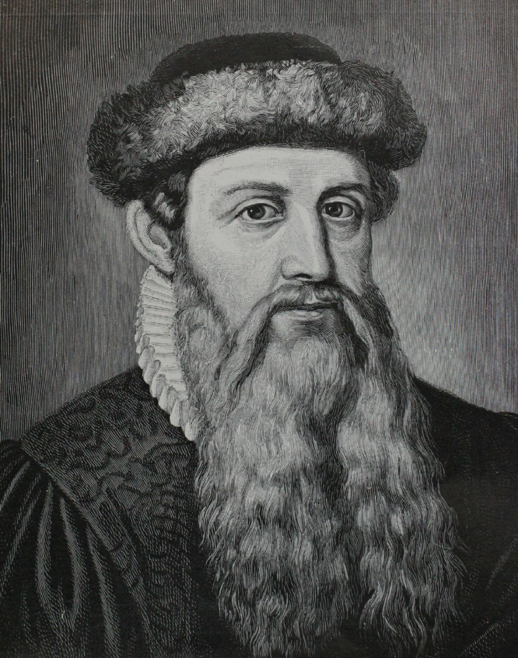
Meet Johannes Gutenberg. We hear his beard is insured for $10,000. Gutenberg built a press and invented movable type. Movable type is what distinguishes typography from everything that came before it (think hieroglyphics and illuminated manuscripts). Then Gutenberg used his big ol’ brain and his beard full of secrets to print the first book, the Gutenberg bible.
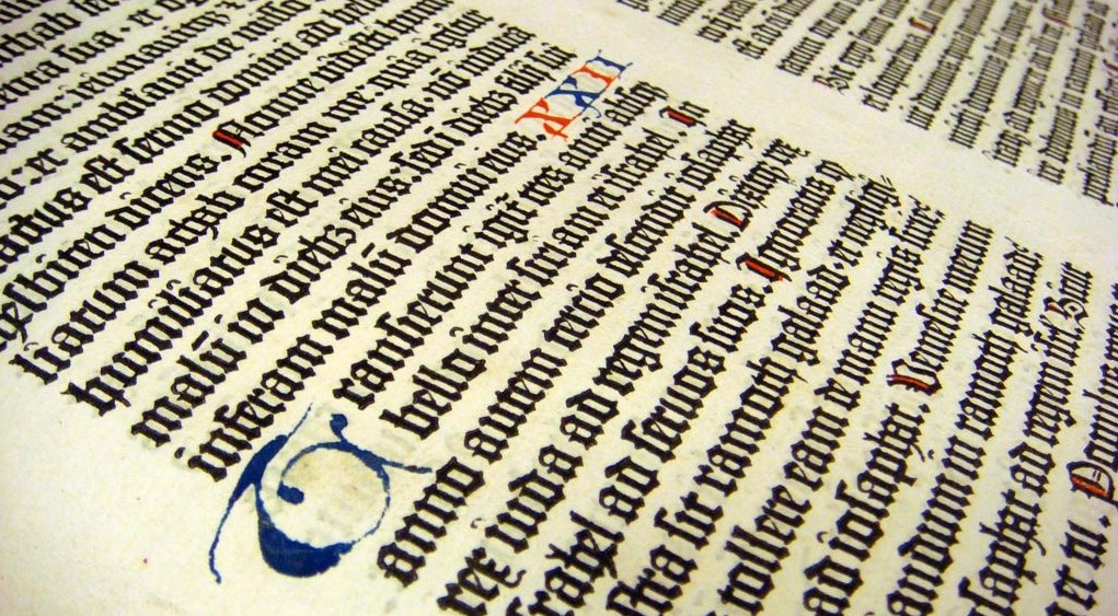
Before the press, your basic 200-page book required four to five months of labor by a scribe. Gutenberg’s letterforms were based on this kind of penmanship and we call the style blackletter today.
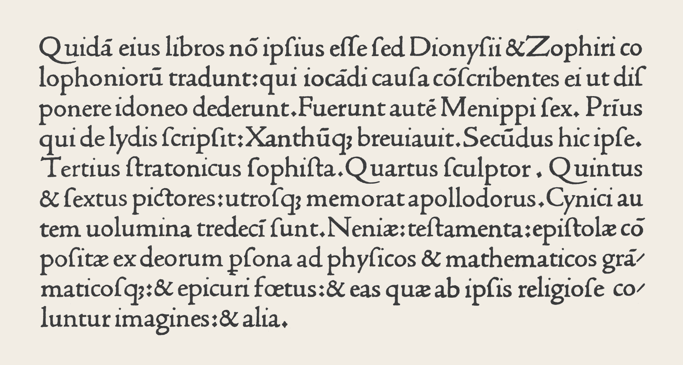
Gothic styles lost popularity during the Renaissance. Greco-Roman classical was in. When Italian handwriting met Gutenberg’s blackletter, the humanist style emerged. The world was introduced to Nicholas Jenson (just as pretty as Gutenberg but people forget about him). Part of Jenson’s lasting influence was the extreme legibility of his fonts. He didn’t just consider the letters, but the space between the letters, for an even tone throughout the page.
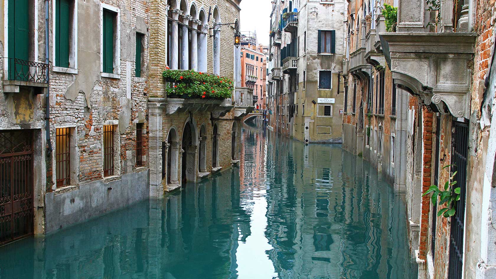
Around this time, a Venetian publisher was working on a cursive form to help economize the printing process. He hoped to fit more words on fewer, smaller pages using condensed type. The man was from Italy, the type was from Italy, and that’s probably why we refer to condensed letterforms as “italics” today.
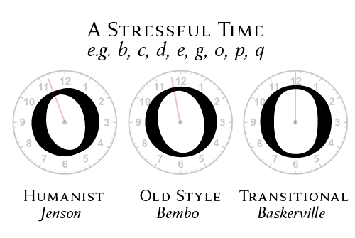
For a while, the evolution of type was like actual evolution—slow, subtle, and boring. Two distinct changes took place in the shift from humanist to old style to transitional type. The stress of letterforms became more perpendicular (further distancing type from calligraphic styles) and we notice a stronger contrast between thick and thin strokes.
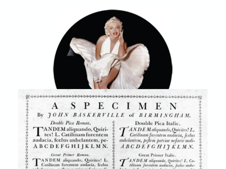
To our 21st century eyeballs, this type specimen from the transitional period doesn’t seem too provocative, but John Baskerville could blow some skirts up. In an age of intricate title pages and printer ornaments, Baskerville opted for a purer style. His wide margins and ample space between letters (kerning) and lines (leading) made for works of brilliant contrast, simplicity, and refinement.
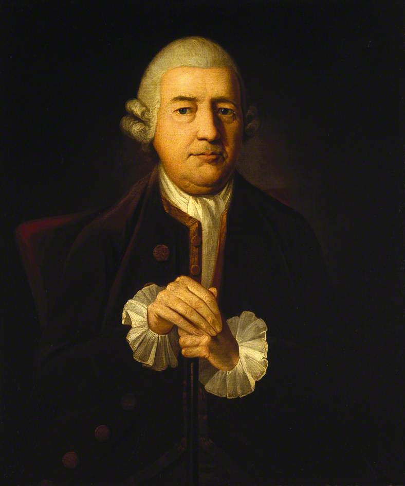
At one point, Baskerville’s contemporaries accused him of blinding the readers of the nation with his outrageous use of contrast. Baskerville said, “I’m sorry people are so jealous of me, but can’t help it I’m so popular.”
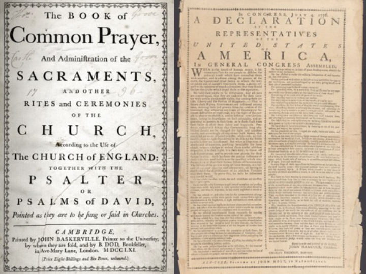
And he was especially popular with Benjamin Franklin. After meeting him in 1758, Benji returned to the U.S. with some of Baskerville’s type, adopting it as a standard typeface for the federal government. Note the similarities between Baskerville’s work and the printed version of our Declaration.
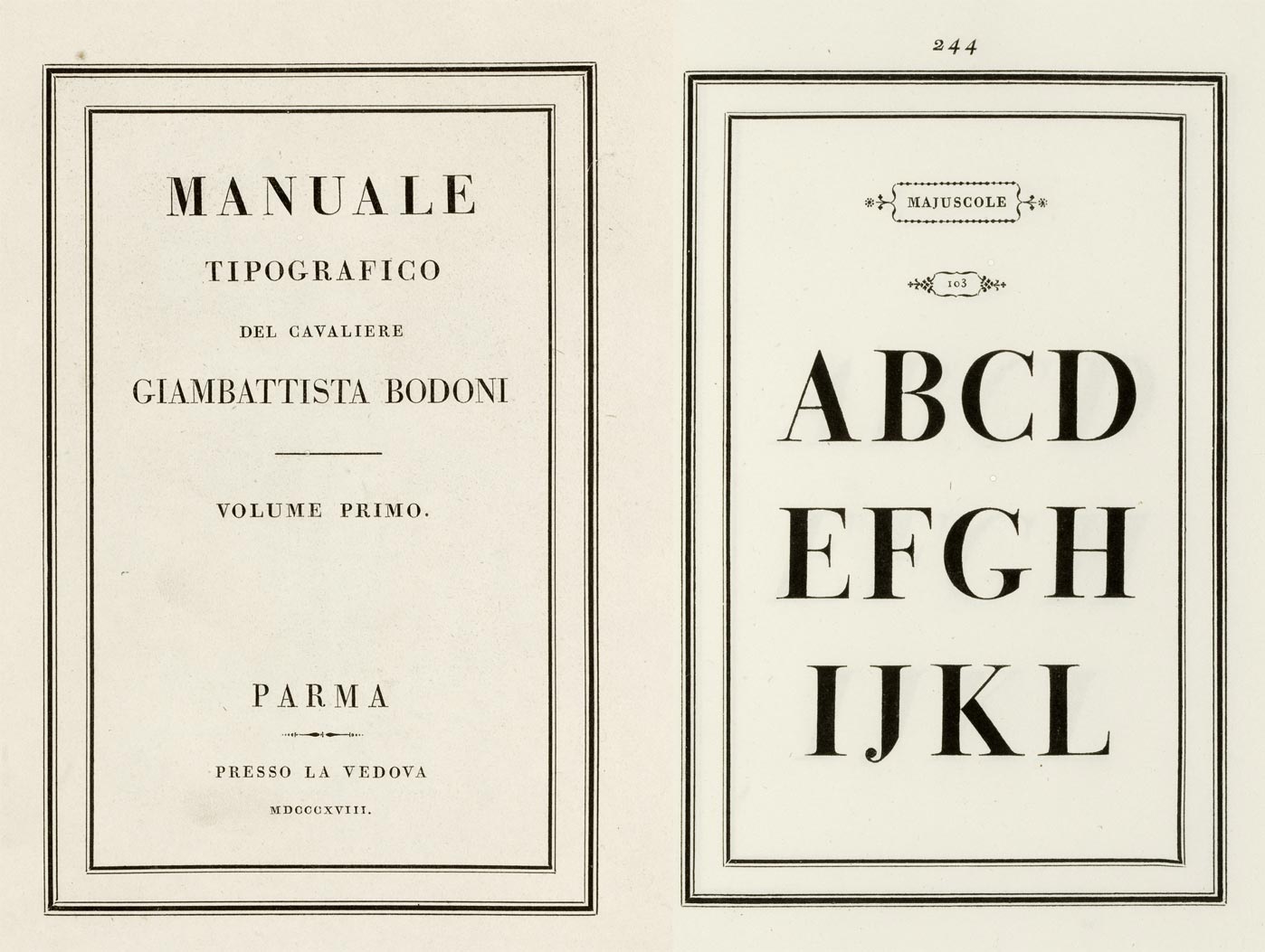
Type reached a peak in perpendicular stress and high contrast with modern styles that include Didot and Bodoni. To this day, these fonts are associated with high-end, luxury brands (think, The VMFA, Vogue, and Vanity Fair).

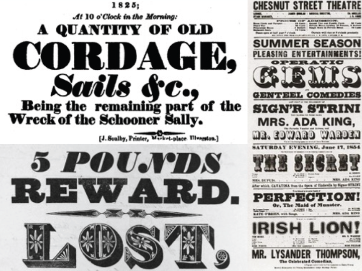
Until the Industrial Revolution and the rise of capitalism, type was primarily used for books and broadsheets. But cheaper, more abundant merchandise stimulated a mass market and greater demand for stuff. Industrialized society prompted an expansion of printers and an increase in advertising and posters. To sell ish effectively, messages had to be bigger, bolder, and louder than competitors’.
Fat face, basically beefed up modern styles, surfaced during this time. As did slab serifs.
Most people know their serifs from their sans serifs, but slab serif is a third classification. Slab serifs have more consistency in their stroke weight with blunt, thick serifs at 90 degree angles. Slab serifs were super fetch, so the cutting-edge technology of the day picked them up. As a result, virtually all typewriter types are slab serifs.
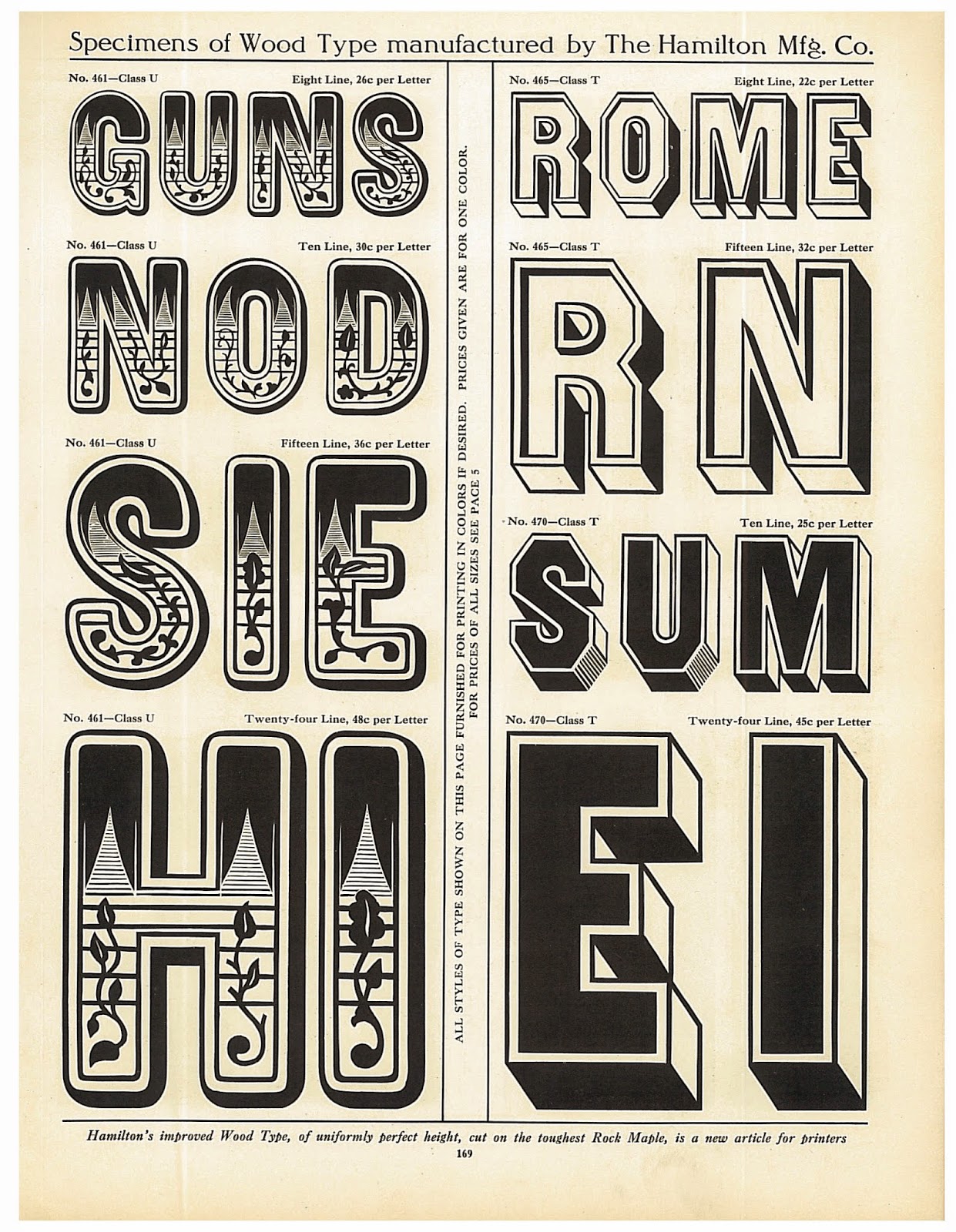
Advertising called for posters, and posters called for massive type. Printers quickly realized that lead couldn’t hold up to the pressure of large-scale printing, so wood letterpress was invented. The dawn of display type (fonts created for headlines and banners) saw the birth of a common typographic error—confusing display fonts with fonts meant for text. A good rule of thumb is while text types can be enlarged and used for headings; display types, when scaled down, can not be used for text setting. (Here’s looking at you, fat face.)
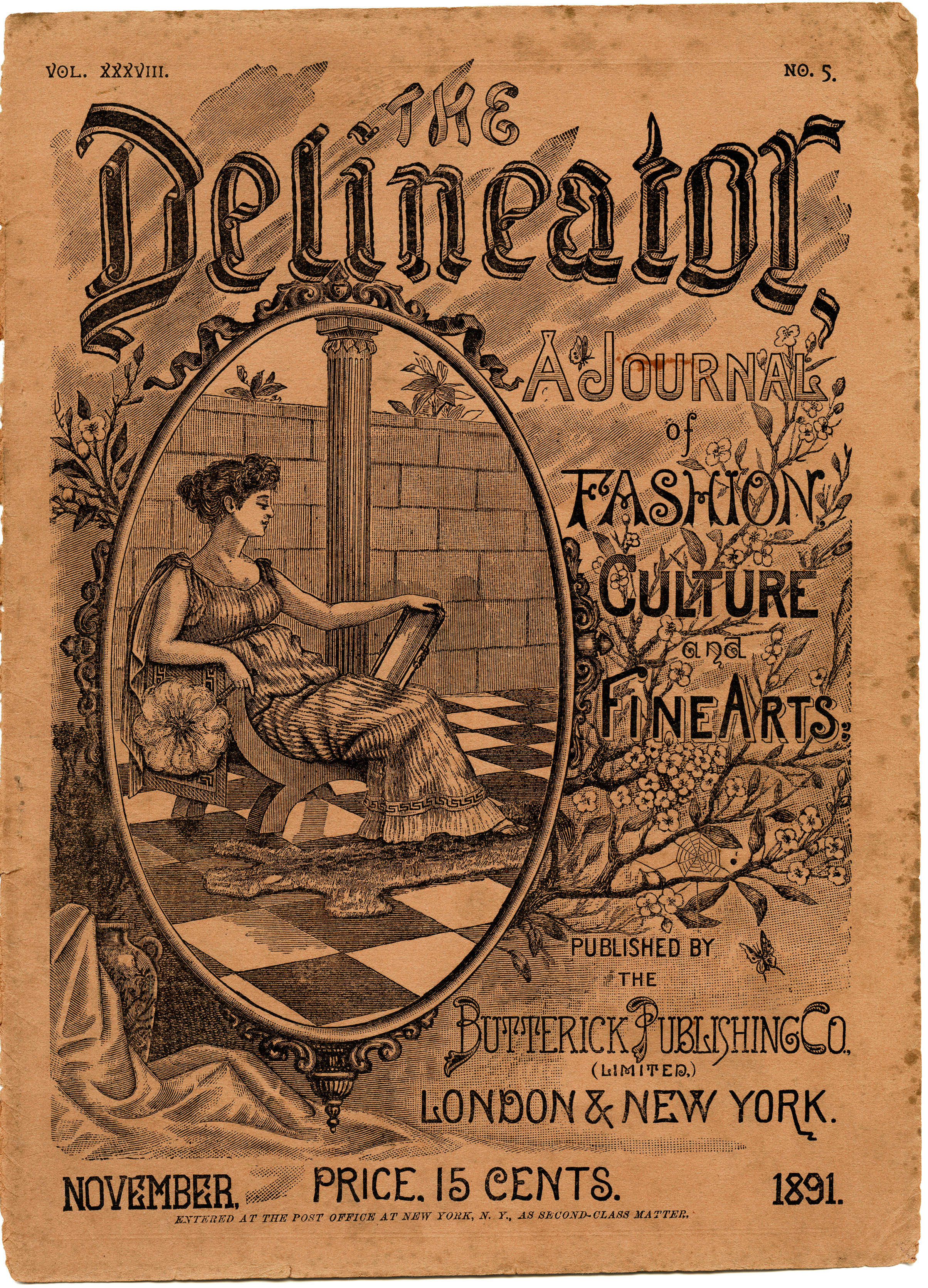
Literacy rates rose in the Victorian Era, and the number of publications in the U.S. grew from 800 to 5,000. Printers competed with elaborate cover illustrations and detailed lithography, ornamental styles so popular they began to influence type.
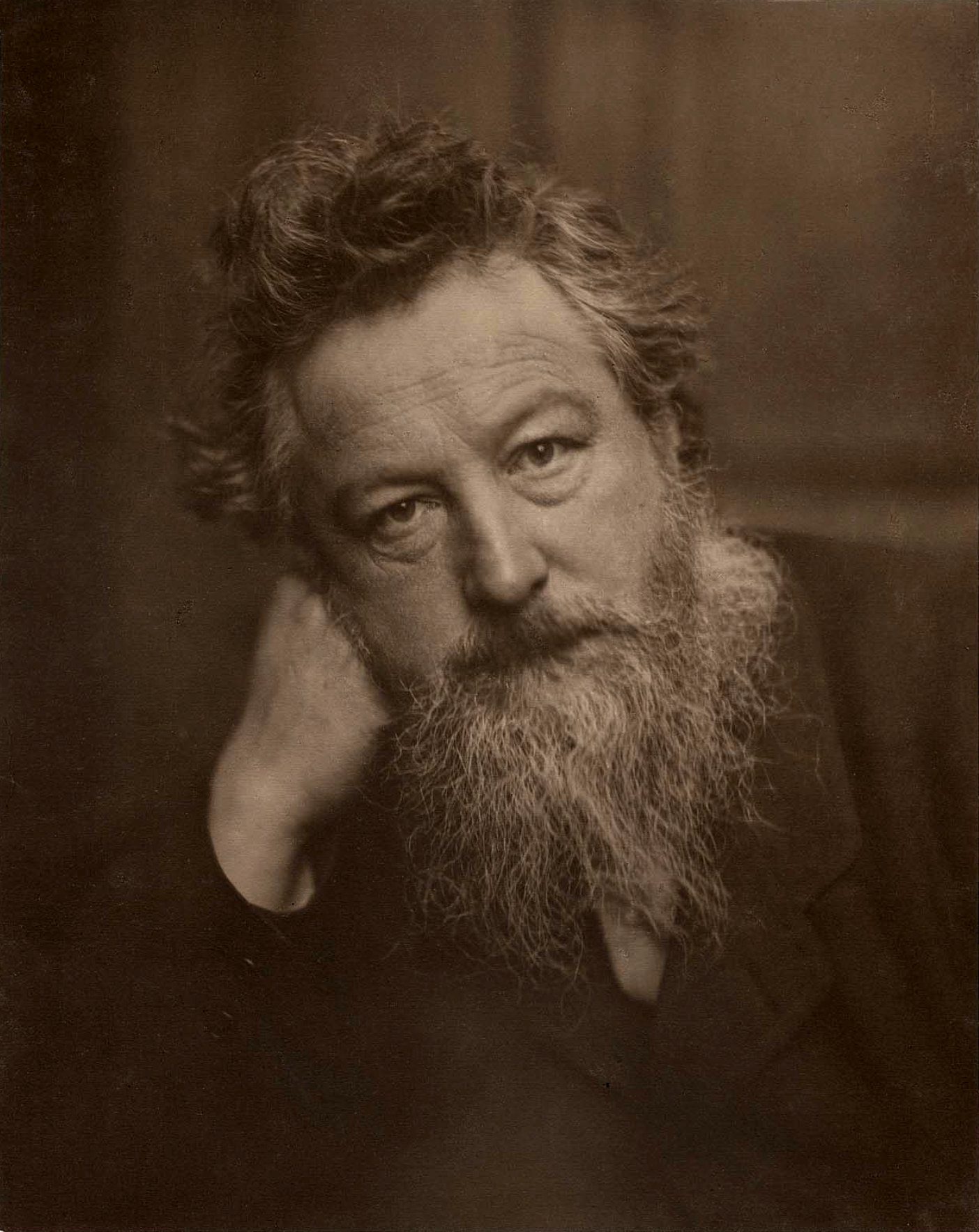
But the Victorian Era had its cynics. An Englishman by the name of William Morris hated the “cheap and nasty” mass-produced goods of the Industrial Revolution. He was basically like, “You’re plastic. Cold, shiny, hard plastic.”
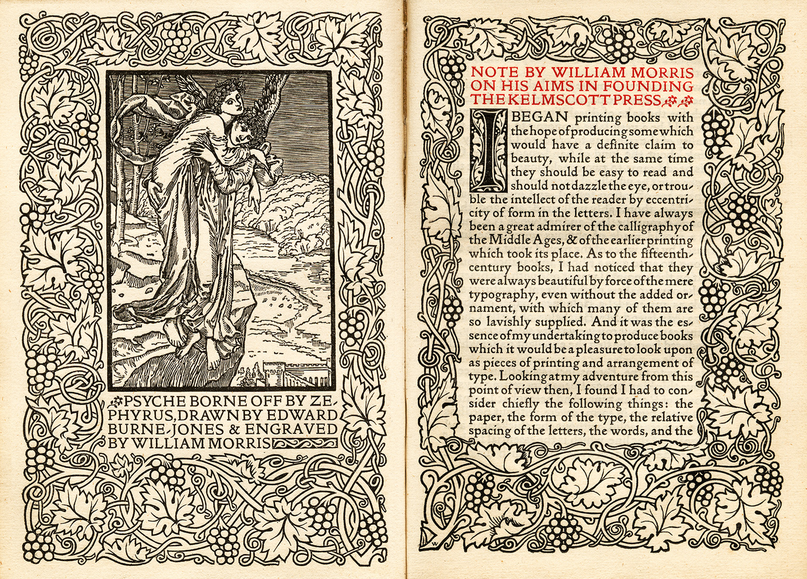
He and his art freak friends led the Arts and Crafts Movement, marked by quality craftsmanship, simple form, and inspiration in nature. Morris drew from medieval stylings of illuminated manuscripts, improving upon Jenson’s early typefaces. His emphasis on hand-made quality led to the rise of private presses all over the world. Think of it as the craft beer revolution of art.
Peter Behrens was nearby being German. Most Germans were about the standardization of design, the belief that form should follow function and ornament is unnecessary. Behrens explored geometric design motifs and was the first person to print a book in a sans serif typeface.
In 1904, he met architect J.L. Mathieu Lauwericks, who taught design based on geometric composition and grids. Behrens began using grid theory in all of his designs, influencing students who would go on to found the Bauhaus school.
Grids began to pop up everywhere in the 20th century, in the work of Piet Mondrian, El Lissitzky, and artists of the De Stijl movement.
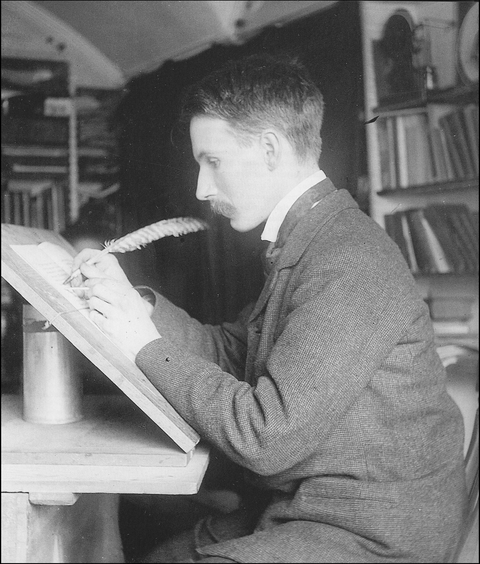
In London, the world’s first electric railway system was underway. A relatively unknown calligrapher was commissioned to design a typeface for The Underground (and I have this theory, that if you cut off all her hair, she would look like Edward Johnston).
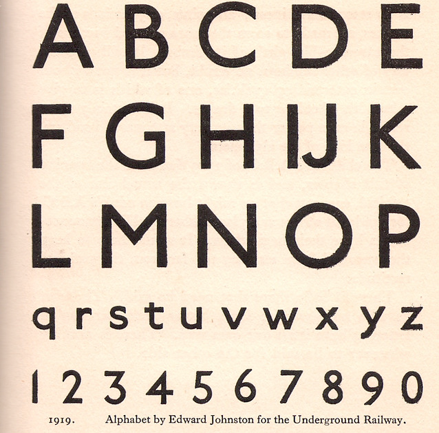
Johnston designed a sans-serif typeface with consistent stroke weights and the proportions of classical Roman inscriptions. He sought functional clarity through the simplest possible forms (the “O”, for example, is a perfect circle.) Spin offs, like Gill Sans and Futura, are in wide use today.
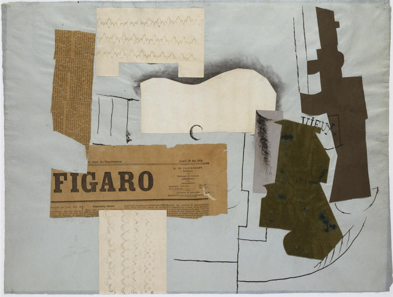
Then Picasso showed up, with his cubism and collage work.
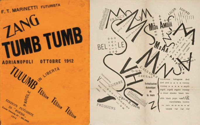
Futurism followed, recognized by an expressive use of non-linear type. Designers sought visual poetry using a rhythmic arrangement of letterforms. These are early examples of deconstructionism, a trend that later resurfaced in the experimental grunge of the 1990’s.

Mid-century Switzerland brought us the Swiss Style. After World War II, international trade increased and relations between countries grew stronger. Type and design were crucial in helping these relationships progress–clarity, objectivity and region-less glyphs and symbols were essential to communication between international partners.
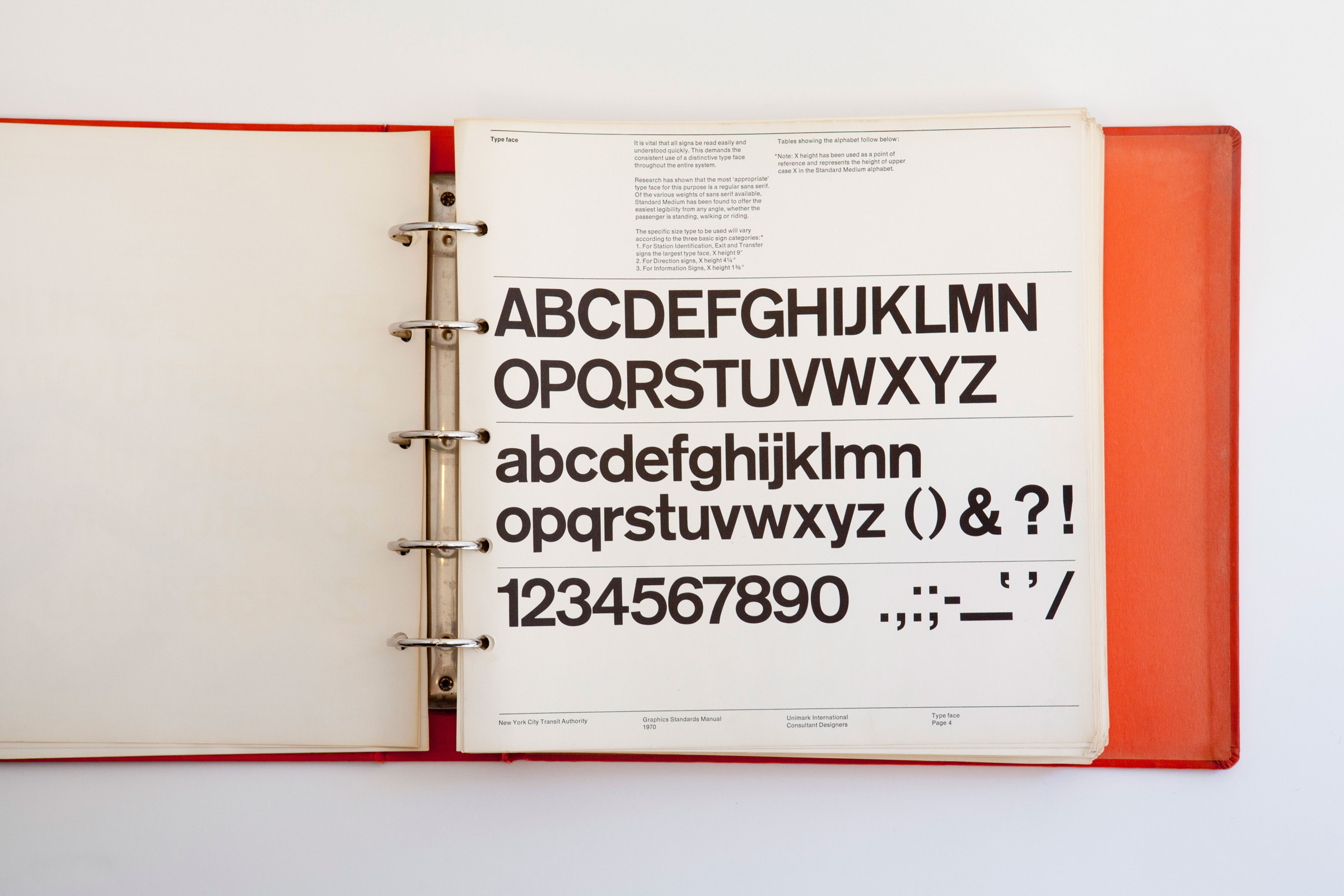
The Swiss Style thrived in this climate, heavily influencing corporate and transit design in 20th century America. Graphic standards for the New York Subway system, developed by Massimo Vignelli, are a prime example.
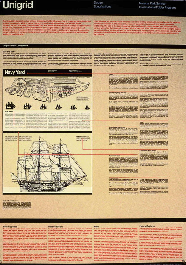
Vignelli went on to create the Unigrid system for the National Park Service. This modular grid system allowed consistent, recognizable structure across all materials and brochures published by the NPS. His work proved that lasting brands are not just logos and typefaces, but systems for widespread application.
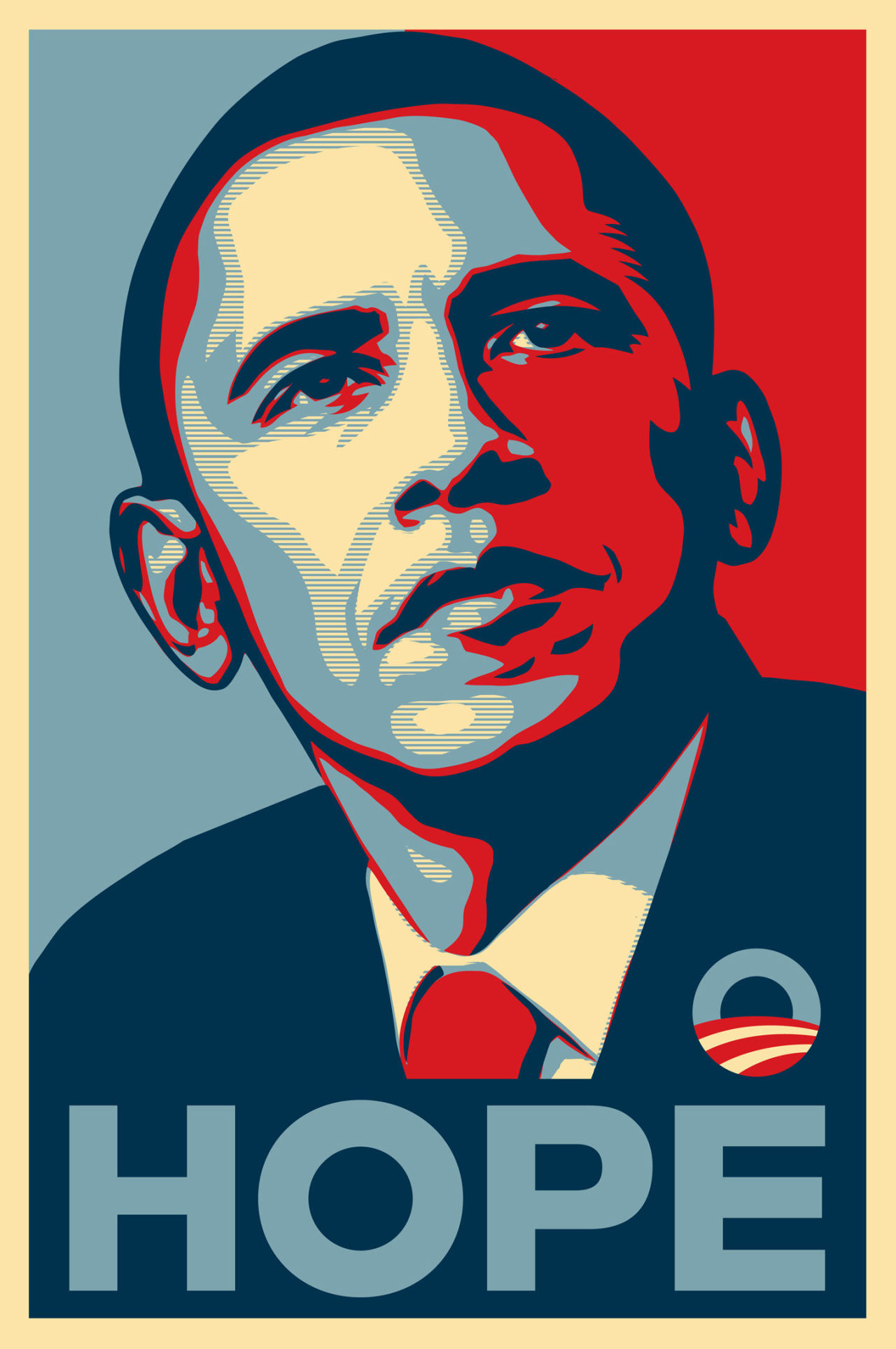
The Swiss Style and Helvetica, the typeface often associated with the movement, have had undisputed success and a lasting influence on American design. Think about that the next time you’re drive your Jeep to Target in a North Face.
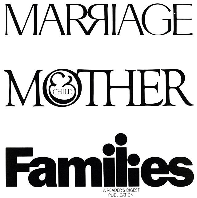
The rise of branding in the 20th century (and the pursuit of its study in the 21st) has placed even more importance on the role of typography. Companies often commission custom typefaces, and typographic logos have grown in popularity—encouraging experimentation in kerning, ligatures, and the use of negative space.
In the digital age, type-setting became obsolete, and design and printer technologies evolved for use on screens.
The first generation of digital type was bitmapped. Bitmapped fonts were fast and practical for computer coding, easily edited for quality and readability.

Designers now work with vector fonts. Using Bezier curves and mathematical formulas, letterforms are scalable and easy to manipulate. Vector fonts are smaller in memory than bitmap fonts, faster to process, and much more versatile. These digitized fonts can be purchased, downloaded, and installed from foundries across the world in just a few clicks.

Two of today’s most influential typographers are Jonathan Hoefler and Tobias Frere-Jones. Their catalog of work is extensive, building upon historic typefaces like Didot and introducing modern classics like Archer.
Many believe that Gotham, a Hoefler-Jones typeface, has been the most significant typeface of the 21st century.
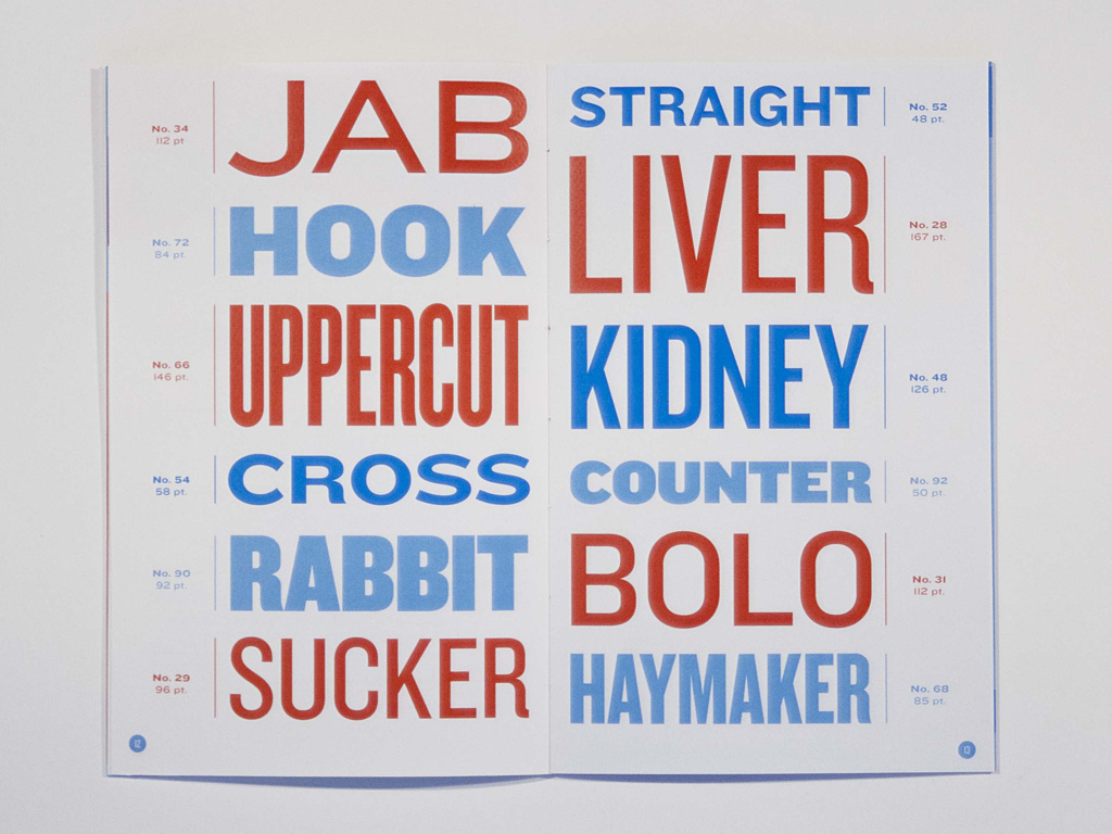
One advantage of vector based typography is the seemingly endless number of weights, styles, and glyphs available. Fonts are constantly updated and expanded upon, and today’s designers rarely want for options. In fact, our greatest challenge is choosing what type to use, when, where, and what to pair it with. Because modern brands are executed in print and digital mediums, appropriate type should also adapt to paper or screen successfully.
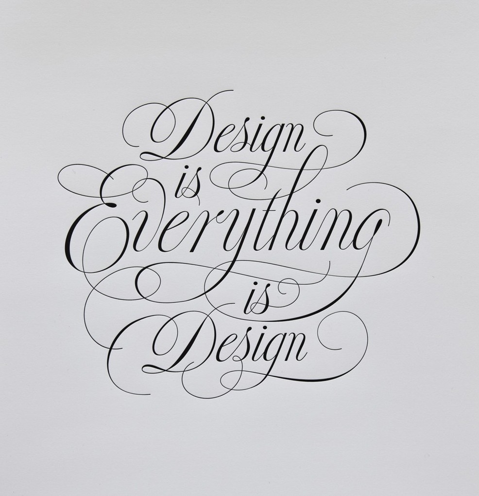
Much like the Arts and Crafts Movement of William Morris’ day, modern calligraphers and letterers have found tremendous success in the wake of digital publishing. Thanks to sites like Etsy and Pinterest, there’s a growing market for letterpressed goods, custom calligraphy, and work by designers like Jessica Hische.
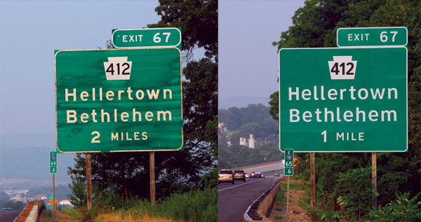
Skilled typographers apply an understanding of human behavior and user experience to their designs. The Clearview font, for example, was the result of extensive research in a study on the legibility of highway signage among nighttime drivers. It is now being implemented on highways throughout the nation.

Someone once said, “If it is worth printing then it deserves to be set in good type.” Someone else said, “Don’t let the haters stop you from doing your thang.” Both are relevant lessons for our Lunch and Learn series and in the next installment of Type in Two Parts, Brent explains how to do your thang without offending the gods of good type.