Design Process Archives - Randall Branding Agency
Randall Branding Agency

Here’s what we’re up to.

Feedback. Ping. Pong.

PingPong

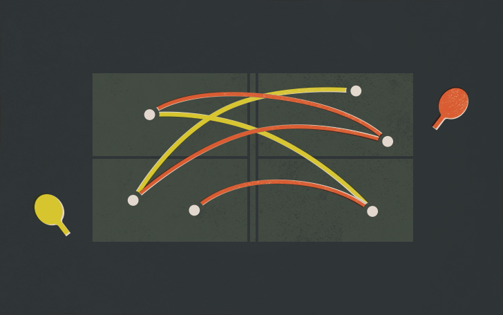
At Randall Branding our design process is like a game of table tennis.

You review designs and ask for changes. Ping. We take your feedback, make improvements and send it back your way. Pong. This back and forth is part of the rhythm of life here at the agency.

We do our best to serve up (get it? serve?) great creative, but providing great feedback is just as important to a project’s success. Here are few examples of Supremely Triumphant Feedback and Not So Supremely Triumphant feedback.

feedback3

Not So Supremely Triumphant Client Feedback

“I don’t know what it is, but the website just isn’t working for me”

“James and Ivan want to see the logo in blue. Britt’s favorite color is hot pink. Personally I think green looks best.”

“Let’s try a different photo on the cover of the brochure.”

feedback2Supremely Triumphant Client Feedback

“We want the website to feel a little more professional.”

“After some internal discussion, we’d like to see the logo in blue — I think this would help visually differentiate us from our competitors.”

“Let’s try a different photo where the mother is younger — we want the brochure to resonate with 20–30 year olds as well.”


Here are a few tips:

1. Try to make feedback as actionable as possible. Spend time thinking about what specifically is in need of improvement.

2. Consolidate changes into one organized punch list. This is especially important if you have multiple folks reviewing a project.

3. Be thorough, and don’t pull any punches! We’re out to make the best work humanly possible, and your critical thinking is invaluable.

4. Be as prompt as your time and schedule allow. The sooner we hear back from you, the sooner we can provide you with a new and improved design.

Great feedback helps us be efficient with our time, and it keeps your project on schedule. It eliminates a project’s weaknesses and amplifies it’s strengths. It also makes us want to stand up on our desks and sing.

It’s a game of table tennis that everybody wins.


Let’s talk Color: A simple guide to color spaces

Color

Here’s a hypothetical for you: You’ve been working with us on a logo for your business. We’ve gone through the design process and arrived at a beautiful & thoughtful mark that reflects your unique characteristics. Awesome! What happens next?

We’ll prepare your logo in a variety of color spaces: RGB, CMYK, and Pantone. These color spaces are used in different contexts, and choosing the right file type for your needs depends on a few factors. It may seem confusing at first, but with some basic information, you’ll know everything you need to get by. Let’s break it down:

Color_RGB

RGB

All RGB colors are made by mixing varying amounts of red, green, and blue light. You should use RGB files in any digital or screen-based context. This includes websites, email blasts, digital banner ads, and tv spots.

Color_CMYK

CMYK

All CMYK colors are made from varying amounts of cyan, magenta, yellow, and black ink. You should use CMYK files in any physical or print-based context. This includes business cards, letterheads, and brochures to name a few. CMYK is often referred to as four-color printing and is the most common (and usually the most economical) method of producing physical pieces.

Color_Pantone

Pantone

All Pantone colors are made from a combination of base pigments mixed in specified amounts. You should use Pantone files in any physical or print-based context where color accuracy is imperative. Pantone is often referred to as spot color printing, and its main benefit is consistency and predictability — a Pantone color will always look the same, regardless of vendor and production technique. Pantone Coated colors are used for glossy surfaces, and Pantone Uncoated colors are used for matte surfaces.

Bam! Now you’re a color space expert! Well, maybe expert is a stretch, but you should know pretty much everything you need to in order to use your logo effectively. However, if you ever feel like you’re out of your depth when it comes to color, don’t hesitate to contact us here at RBA.

If you want to know more about us, you can jump over here. If you’d like to see what we do, you can always jump over there.