Lunch and Learn Series: Type Part Two
We teamed up with the fine people at Torx Media for a monthly Lunch and Learn series in Suite 200. Just like Keynote slides and Jojo’s buff chick pizza, we go great together, and decided to share the fun on our blog!
In part one of our type series Megan explored the rich history of type. For part two, Brent got into the practicalities of using it. You don’t have to be a wizard: a basic understanding of typographic principles can dramatically improve your communications!
There’s a good chance that you work with letters on a regular basis, even if you’re not a designer. Whether you’re writing your autobiography or creating a powerpoint presentation, here are 10 simple rules you can follow to make your documents sing.
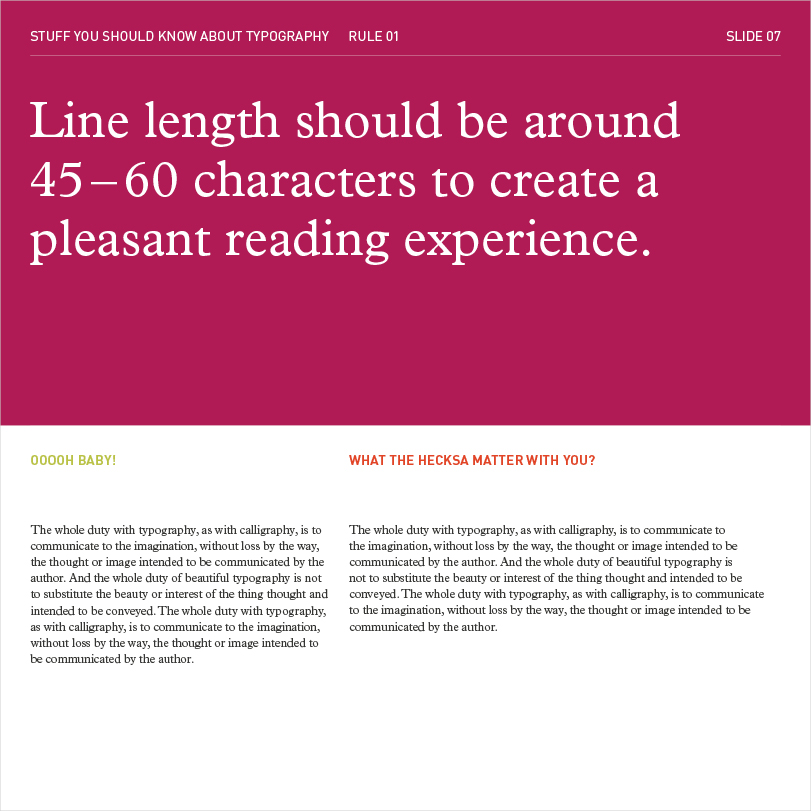
Be careful not to exhaust your reader’s eyeballs! Too short of a line and a reader’s train of thought is unnecessarily interrupted. Too long and the eye has trouble finding where the next line begins.
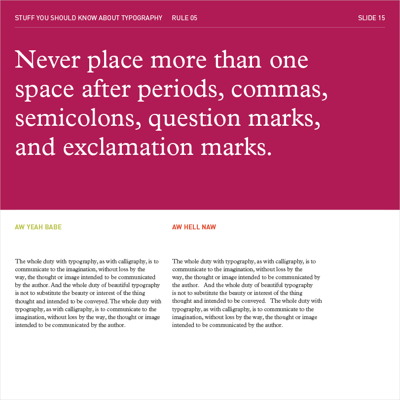
It seems like all of us were taught to double space at the beginning of a new sentence, but it actually impedes legibility.
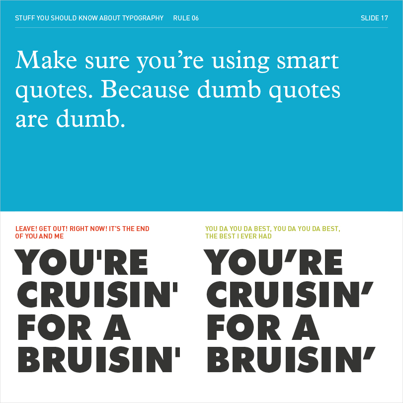
Straight, or “dumb” quotes, are actually used to indicate measurements like inches and feet.
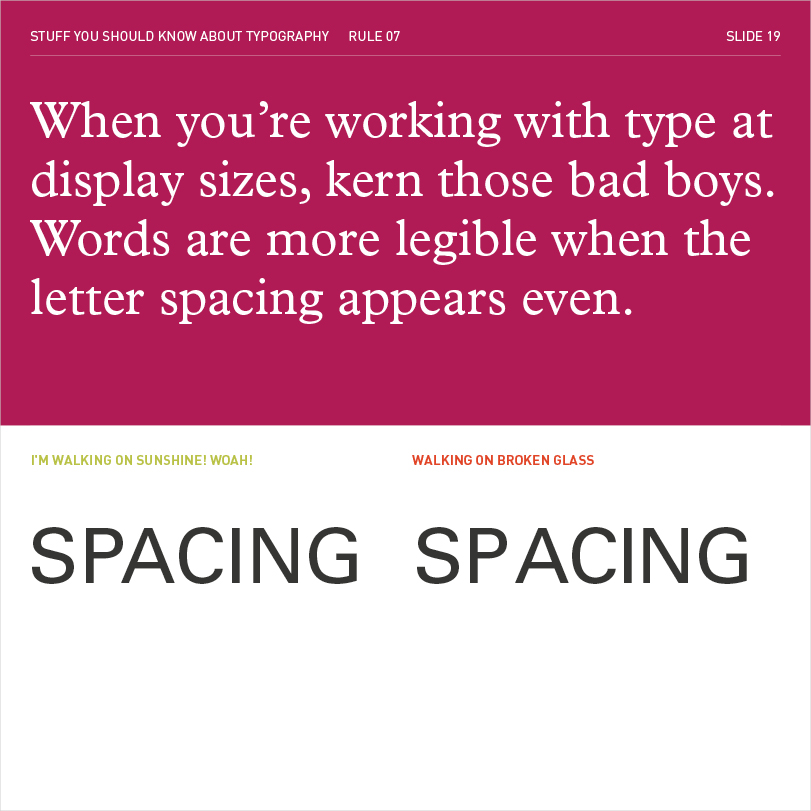
Kerning is one of those subtle details that make or break a design.
As with so many other things, with typography, the devil is in the details. The average reader will not be conscious of your typographic decisions. But on a subconscious level, they’ll appreciate how easy your documents are to understand and digest. Things will just “feel” cleaner and more professional. Good typography makes communications more legible, usable, and ultimately, more human.
Now get out there and make the world a more beautiful place!